The Real Reason Why Everyone Is Leaving Your Website
To be an effective marketer in 2017 and beyond, you must be well-versed in several skills.
One skill that has emerged in the current digital age is user experience design, or UX design for short.
In this blog series, I will cover simple but effective tips that will make your users’ website experiences much more enjoyable and, ultimately, turn them into loyal customers.
First, let’s talk about decluttering your site. This is one issue our agency has fixed over the past year, which has caused us to grow and retain our user base exponentially.
One common tendency marketers have is to include everything they’ve ever created onto every single page of their website.
They want the top navigation bar to have a million links and they want dropdown menus to add even more.
They want textures upon textures to cover every pixel of white space, and they want to include every single word in the English dictionary.
This hurts user retention rates and destroys your user’s experience.
Declutter The Navigation
When the top navigation is cluttered and contains too many links, it confuses users and also inhibits their ability to navigate to the pages that want to visit.

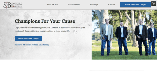
Your site’s top navigation is prime real estate and it should be reserved for only the most important links in your site. Here are two examples of clients' websites where we have cleaned up the navigation.

Some of you may be asking “What if all of my pages are equally important?” Here’s a hint for you — they aren’t so quit trying to shove everything in your navigation!
If you are having a hard time conceptualizing this, here is a helpful tip: The level of importance that each page holds is not based on your emotional attachment to your content, nor is your site about you. It is about your users and what they deem important to them. Data and analytics will give you an accurate way to rank your pages. You can learn more about this by reading our blog on Growth-Driven Design.
Get Our Ultimate Guide On Growth-Driven Design
Not all pages are equal in their level of importance and space is limited at the top of the screen, so it is crucial for marketers to use analytics to determine which pages deserve the top spots in the navigation. All others can be linked at the bottom in the footer or they can be placed strategically on related pages.
Give Text Room To Breath
Text is a major component of any website. Just like the navigation, people tend to want to shove as much text as possible into the limited spaces of their websites. There are probably several reasons for this but more than likely people are just afraid that if they don’t do this they will potentially leave out something important.
Don’t give in to this urge. Being able to say more with less is a valuable skill that should be developed, especially for a website. Your users don’t want to read huge blocks of text in most cases. They will get bored quickly and will leave your site. Be clear and concise with your thoughts.
On the rare occasion your users will be reading large chunks of text, such as blog posts, you should be sure to use a font size that is easy to read. This will help reduce eye strain and fatigue your readers may develop while trying to read smaller text.
Another effective technique is to choose a comfortable line height for the lines of text. When the line height is too small, there is a cluttered, squatty feeling that gives the perception your users are reading way more text than is actually there. When you choose a comfortable line height the text is given some breathing room and will be easier to scan and read.
White Space Is Your Friend
White space is a wonderful thing. This space around elements of your pages is what creates good alignment, gives breaks between sections, and gives your users a sense of space. Utilize this space.
Don’t try to fill up every pixel on your users’ screens with something unless there is a purpose for it. Textures are great tools but can be overwhelming if they are used improperly. When in doubt, just stick to keeping white space.

When it comes to your users, decluttering your site can be a subtle but powerful way to improve their experience. The more they enjoy interacting with your site, the more likely you will be to convert them into customers. Pay attention to details, don’t overload your website with clutter, and watch as your company grows.
Want more tips on how you grow your online presence? Download our FREE whitepaper and grow your business in seven easy steps!


