8 Reasons Why Your Website Sucks & What To Do About It
Your company’s website sucks.
There is no putting it off any longer. It’s time to design and build a new website.
You’re probably excited to take on this project, but also nervous that you will ultimately waste time, money and effort just to build yet another website that doesn’t seem to communicate with your audience, no matter how pretty it is.
In this blog, I’ll outline eight simple steps you need to take in order to create a website that gets the results you want.
As a designer and marketing professional, I understand how frustrating it can be to put your heart and soul into a project just to see it flop once it’s finished. Thankfully, you don’t have to go through that again!
You can design a website for your business that you know will communicate with your audience, be effective and will make you look like an all-star to your boss and coworkers.
Step 1: Stop focusing on the aesthetics.
Is aesthetics important? Yes. Is aesthetics everything? No!
Done are the days where web design is completely centered around who can build the prettiest website. You know why? Because those pretty websites suck.
They didn’t bring in leads for the business that designed, built and paid for those websites. They just sat there on the web like an underappreciated trophy wife. When designing your website, the most important design pillars to hit are these:
- Is it easy to visually navigate?
- Does it make sense?
- Does your audience understand who you are, what you do/sell and why it matters to them in five seconds or less?
“Clarity is the new creative,” according to StoryBrand founder, Donald Miller. If you confuse you lose because the confused don’t buy.
Sign up for the StoryBrand Marketing Course, here.
Step 2: Create a tagline for your company.
Your tagline should be displayed prominently at the top of your homepage. It should be a simple and clear, but a compelling one to two sentence description of what you do.
Examples of good taglines:
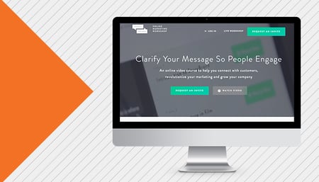
- Clarify Your Message So People Engage
An online video course to help you connect with customers, revolutionize your marketing and grow your company. - Get Cooking
Delicious ingredients you’ll love to eat. Simple recipes you’ll live to cook.
- Our Mission
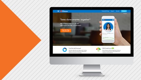
Charity: Water is a non-profit organization bringing clean and safe drinking water to people in developing countries. - Taxes Done Smarter, Together
We’re here to help you all year with expert life help, on demand
Step 3: Make it painfully obvious how customers can buy from you.
Now that your potential customer is on your website, they shouldn’t have to participate in an Easter egg hunt just to figure out how to engage with your brand. Provide them with pronounced call-to-action (CTA) buttons that tell them how to take the next step.
Example CTAs:
- Get A Quote
- Call Us Today
- Schedule An Appointment
- Buy Now
Not everyone that visits your website will be ready to commit to your brand, however. They will need a little bit more convincing. The examples above are Direct CTAs, but you’ll also want to provide your viewer with Transitional CTAs if they feel that they need to vet you out a bit more before committing to a relationship with your brand.
Example Transitional CTAs:
- Read Our Client Testimonials
- Read Our Case Studies
- Download Our Free Checklist
*Placement is key! The top right corner of your website is GOLD. There should always be a direct CTA clearly and prominently displayed in that spot. There should also be a Direct and Transitional CTA displayed under the opening section and then displayed several times more throughout the homepage.
Step 4: Highlight the success of your customers with imagery.
Designers and lovers of aesthetics, this is your time to shine! Make your website visually appealing while also connecting with your audience in a positive way.
Show photos and illustrations of things that would be considered a ‘win’ for them or aspirational. When your audience sees this imagery, they should think, “That’s it! That’s exactly what I want, who I want to be and how I want to feel!”
Examples:
- If you’re a landscape company, DO NOT show pictures of grass clippings, heavy mowing equipment and sunburns. DO show pictures of the types of beautiful lawns that make the neighbors jealous or display families and friends enjoying time in their outdoor oasis.
- If you’re a personal trainer, DO NOT show pictures of people eating salads, feeling uncomfortable in their skin and being intimidated by the person on the treadmill next to them. DO show pictures of happy confident healthy individuals. Show pictures of people reaching their goals and changing their lives.

- If you’re a dentist, DO NOT show pictures of oral surgery and painful root canals. DO show pictures of smiling, confident people with beautiful smiles and clean teeth.
Step 5: Give visitors an easy plan to follow.
On your website, visitors should understand what you offer and how that product/service would benefit them.
They may even see the CTA that lets them engage with your brand right away. But do they know what steps will be taken to solve their problem once they engage with you?
This is where including a three to four-step plan on your website will benefit you. This is not the place where every single behind-the-scenes step should be listed. Any plan longer than four steps looks complicated and tedious, so trim it down as best you can.
Examples Plans:
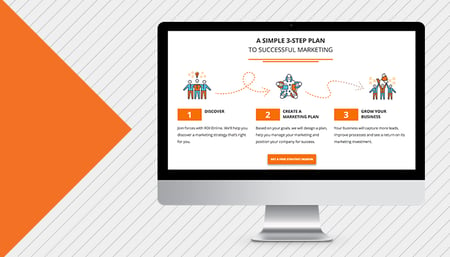
ROI Online
- Discover
Join forces with ROI Online. We’ll help you discover a marketing strategy that’s right for you. - Create A Marketing Plan
Based on your goals, we will design a plan, help you manage your marketing and position your company for success. - Grow Your Business
Your business will capture more leads, improve processes and see a return on its marketing investment.
CarMax
- Bring in your car
- Let us appraise it
- Get your offer
StoryBrand
- Create a buzz
Create clear and compelling messages that spread like wildfire. - Learn a language that sells
You don’t have to come off as a pushy salesman to move product. - Become a marketing master
You’ll have a proven filter to clarify all of your marketing material.
Step 6: Make all website content SHORT and easy to digest.
The confused don’t buy. This is your chance to communicate clearly with your audience, not your chance to dazzle them with industry jargon, ‘wow’ them with hard-to-follow analogies or impress them by using $10,000 words (that they have to look up in the dictionary.)
If your message is hard to follow and doesn’t connect with what it is your customer wants and the pain points they are feeling, they will leave, and they will seek comfort in your competitor's arms. You have approximately five seconds to impress or interest a person on your website. You can’t do if your homepage is a novel.
Step 7: Always position your customer as the hero and your brand as the guide.
We get it — your company is AWESOME. But you aren’t as awesome as your customers are.
The story you tell needs to be about them and how you (as the guide) can help them be the badass hero of their own movie.
No one cares about a product that wants to swoop in, save the day and win the girl. You are Dr. Emmett Brown and your customer is Marty McFly. You are Mr. Miyagi and your customer is Daniel.

Step 8: Sit back and relax while your website brings in leads!
Do these things and your website will look great (and won’t suck)! It’s a lot of work, but we promise, it’s worth it.
As you can see, here at ROI Online we follow the StoryBrand Framework. If you want to clearly communicate to your audience and grow your business, we can help you do that! We are a StoryBrand-Certified Agency and also offer StoryBrand QuickStart Kits to help you get started.


