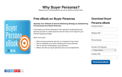
What Is A Landing Page And Why Is It Important?
A landing page; it sounds pretty straightforward right? It’s a page a visitor just “lands” on. Wrong. It’s easy to get a landing page confused with other pages on your website. Yes, it’s a web page, but not just any old web page. To give you a better idea of a landing page, think of alligators and crocodiles. All alligators are crocodiles, but not all crocodiles are alligators. Now insert landing page and web page in there: “All landing pages are web pages, but not all web pages are landing pages.” Does that make more sense?
While, yes, you can technically “land” on any web page, a landing page differentiates itself from other pages in that it is strictly for a conversion. It will have a form, to either submit a question or comment, download a demo or trial offer, sign up for email, buy a product, etc.
What’s the Form on a Landing Page for?
A landing page’s sole purpose is to “capture” a visitor’s information through said form. The lead form presents you or your business with an opportunity to convert a website visitor to a lead to a potential customer. For example, a visitor could enter their email address to download an eBook or subscribe to your newsletter. On the other hand, the person can enter transactional information to purchase a product or sign up for a free trial.
Target your Visitors
A landing page allows your business to target a certain type of visitor, the ones you want to become your customers in the end. Rather than cramming your homepage with all these opportunities for your visitor, such as links to your social media networks, a button for a free trial offer or an opportunity to subscribe to your business’s blog, make a targeted landing page. Making a targeted landing page can help you increase the possibility of converting web traffic into leads. Point your customer in the right direction.
Where Should I Put A Landing Page?
A landing page should be on its own. You can place forms on other pages, say your homepage or your blog. However, your homepage and blog exist for other purposes, not simply to extract information from the visitor. Having a form on a page does not make it a landing page, persay. Think of a landing page as the wallflower at your middle school dance. It is by itself, completely. No one is standing next to it. No one is talking to it. When you visit a landing page, there are no distractions: no ads, no other forms. The intent of a landing page should be plain and simple for your web visitors.
What Should be on a Landing Page?
Whether you already have a landing page or you’re ready to make one, please keep the following elements in mind when designing your targeted landing page.

-
Minimize website navigation: As we mentioned before, you don’t want a jam-packed page because then your visitors will get sidetracked. A landing page should be a separate page where the visitor is boxed in. There should be a few exit strategies in case the visitor wants to escape: exiting the screen or entering their information - preferably the latter, right? You want them to focus on filling out the required information.
-
Provide something of value: The point of a landing page is to get a visitor’s information and convert them to a lead. But how can you do that without offering something of value? Nobody’s going to enter their contact information for a free pencil! Whether you want to offer a free, educational eBook, a 30-day trial offer for your product or a contest entry form to win an iPad, you need to make that plain and clear.
-
Encourage sharing: Get your social networks on there: Facebook, Twitter, LinkedIn, Google+, Pinterest, whatever your poison. Add links and icons so your visitors/leads can share this wonderful offer with their Facebook friends and Twitter followers.
-
Keep it simple: Like this bullet point, keep the landing page straightforward, easy to use and simple!
-
Test it: Don’t forget to test to make sure the landing page works. This may seem an obvious step in having a landing page, but we just want to what works one month may not work next month. Change out fonts, colors and form types and see which one generates the most responses and leads. Through experimenting, you can tailor your landing page to appeal to your ideal audience so you can capture them.
We get that all of this is a lot of information to grasp. If you have any questions about landing pages or any aspect of internet marketing, contact us at ROI Online. Landing pages are a huge benefit to a business, so it’s critical they are used to your advantage.
Questions and Final Thoughts
What are you currently doing with your business’s website to attract potential customers and convert leads? Do you have a successful landing page, or do you think your current landing page needs some tweaking?


